Client

Client

Client

Conceptual App Redesign

Conceptual App Redesign

Conceptual App Redesign

Role

Role

Role

Product Designer

Product Designer

Product Designer

Duration

Duration

Duration

1 Month

1 Month

1 Month

Tools

Tools

Tools

Figma, Sketch, Miro

Figma, Sketch, Miro

Figma, Sketch, Miro

Starbucks App Redesign

Starbucks App Redesign

Starbucks App Redesign

Reimagining The Current UI

Reimagining The Current UI

Reimagining The Current UI

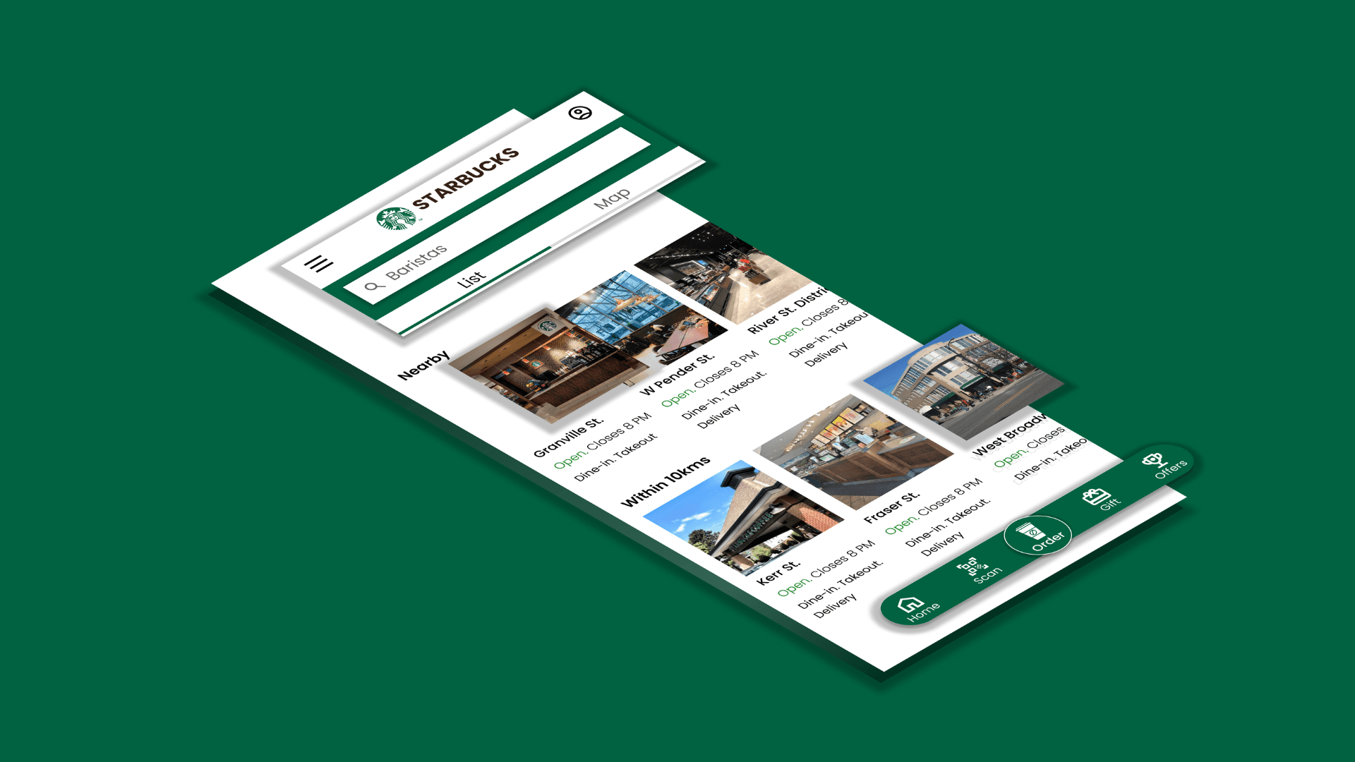
In the Starbucks app, the home and order experience is central to how users interact with the brand. I conducted a case study on its interface and reimagined the experience to make ordering simpler, navigation cleaner, and store discovery more intuitive - all while keeping the signature Starbucks feel.

In the Starbucks app, the home and order experience is central to how users interact with the brand. I conducted a case study on its interface and reimagined the experience to make ordering simpler, navigation cleaner, and store discovery more intuitive - all while keeping the signature Starbucks feel.

In the Starbucks app, the home and order experience is central to how users interact with the brand. I conducted a case study on its interface and reimagined the experience to make ordering simpler, navigation cleaner, and store discovery more intuitive - all while keeping the signature Starbucks feel.

01.

01.

01.

Closer Look of the Redesigned Interface and User Flow

Closer Look of the Redesigned Interface and User Flow

Closer Look of the Redesigned Interface and User Flow

02.

02.

02.

Meaningful Motion

I designed key interactions using motion to add clarity and flow to the experience. Each transition was crafted to feel smooth, intuitive, and effortless.

03.

03.

03.

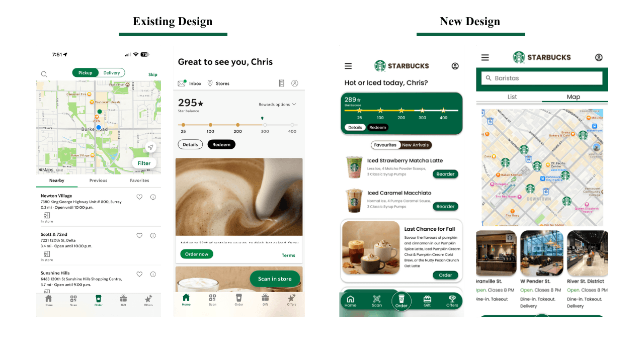
Design Comparison

I compared the existing Starbucks app with my redesigned version to highlight usability gaps and visual inconsistencies. The comparison helped validate how the new layout simplifies navigation and enhances the overall experience.
Understanding The Current Interface

Understanding The Current Interface

Understanding The Current Interface

01.

01.

01.

Users Goals & Tasks

On the current Starbucks app, users primarily open the app to quickly reorder their favourite drinks, explore new arrivals, or find the nearest store to place a pickup or dine-in order. The key tasks they perform include:

  • Browsing the home screen filled with multiple menu options, offers, and banners to locate the “Order” section - often resulting in unnecessary scrolling or confusion due to visual clutter.

  • Finding their preferred store in the order page’s list view, which currently lacks store images — making it harder for regular customers to recognize familiar locations they often visit.

  • Switching between stores or searching manually, since the absence of a clear visual cue (like store photos) forces users to rely only on text-based information such as names, distance, or hours.

  • Attempting to compare stores for pickup convenience, but without contextual visuals or clear indicators of available services (like drive-thru or mobile pickup), decision-making becomes slower and less intuitive.

02.

02.

02.

Current Home Screen and Options Available

The existing Starbucks home screen attempts to serve multiple purposes at once — promoting offers, showing rewards, suggesting menu items, and linking to various features. While informative, this results in a visually crowded and functionally fragmented experience.​

Users are immediately met with a mix of banners, quick links, and scattered navigation options that compete for attention rather than guide it. The abundance of icons and categories, without clear hierarchy, makes it difficult for users to focus on what they came for — whether that’s reordering a favourite drink, discovering seasonal items, or checking their rewards progress.​

The home screen also lacks a defined information structure, meaning essential tasks like “Order,” “Pay,” or “Rewards” feel buried among secondary content. This overexposure of features dilutes user intent, forcing them to scroll or tap multiple times before reaching their goal.

In short, the current layout prioritizes showing everything at once instead of creating a calm, intuitive, and purposeful entry point into the Starbucks experience. The redesign aims to fix this by introducing visual hierarchy, condensing the navigation into a hamburger menu, and surfacing relevant actions through smarter toggles and personalized sections.

03.

03.

03.

Current Order Page

The current Starbucks order page combines a small map view with a list of nearby stores displayed below. While it gives users the ability to filter between Pickup and Delivery, and view details like store hours and distance, the layout relies heavily on text. The list lacks any form of visual recognition—there are no store photos or thumbnails to help users identify their usual Starbucks location quickly.

For regular customers, this absence of visual cues can be frustrating. Many can recognize their favorite store by its appearance or environment, but the existing design forces them to scan through addresses and text instead. The experience feels more functional than intuitive.

Additionally, the map and list views coexist but don’t truly interact - users can’t directly identify which store in the list corresponds to which pin on the map without extra effort. Features like dine-in, drive-thru, and mobile order availability are represented only through small icons, which aren’t immediately noticeable.

​Overall, the current order page provides the right information, but lacks visual clarity and user familiarity. It functions more as a locator tool than a seamless, engaging order experience. My redesigned version introduces a cleaner visual hierarchy, store images, and a smoother transition between list and map view, allowing users to browse and choose their store with confidence and speed.

Ideating and Sketching

Ideating and Sketching

Ideating and Sketching

After defining the goals and structure, I translated my sketches into low-fidelity wireframes to visualize the layout and flow. This stage allowed me to quickly explore different placements for key elements such as navigation, filters, and store cards - ensuring the experience stayed intuitive before moving into detailed visuals.

After defining the goals and structure, I translated my sketches into low-fidelity wireframes to visualize the layout and flow. This stage allowed me to quickly explore different placements for key elements such as navigation, filters, and store cards - ensuring the experience stayed intuitive before moving into detailed visuals.

After defining the goals and structure, I translated my sketches into low-fidelity wireframes to visualize the layout and flow. This stage allowed me to quickly explore different placements for key elements such as navigation, filters, and store cards - ensuring the experience stayed intuitive before moving into detailed visuals.

01.

01.

01.

Paper Wireframes

I began the design process by sketching out paper wireframes to quickly explore different layout ideas and user flows. This stage allowed me to visualize how key features—like the simplified home screen, favorites toggle, and list/map views—would function together before moving into digital refinement.

02.

02.

02.

Usability and Testing

To validate the effectiveness of the redesigned Starbucks app, I conducted usability testing with a small group of participants who regularly use the app for daily coffee orders. The goal was to understand how the new interface improved navigation, ordering efficiency, and overall satisfaction.

Objectives

  • Evaluate the ease of navigation between the Home, Favorites, and New Arrivals sections.

  • Test the intuitiveness of the list and map toggle view.

  • Measure how quickly users could locate and order from their preferred store.

Key Insights

  • Improved Order Efficiency: The Favorites toggle enabled users to reorder in fewer steps.

  • Enhanced Spatial Awareness: The map view with store previews made it easier to choose the right location visually.

  • Reduced Cognitive Load: Users found the new layout cleaner and less overwhelming due to the organized hamburger menu.


The New Design

The New Design

The New Design

When designing the high-fidelity interface, I focused on creating a clean, modern visual style and smooth transitions while ensuring the Starbucks brand identity remained consistent throughout the experience.

When designing the high-fidelity interface, I focused on creating a clean, modern visual style and smooth transitions while ensuring the Starbucks brand identity remained consistent throughout the experience.

When designing the high-fidelity interface, I focused on creating a clean, modern visual style and smooth transitions while ensuring the Starbucks brand identity remained consistent throughout the experience.

01.

01.

01.

Overview of the Flow

Overview of the Flow

Overview of the Flow

02.

02.

02.

Closer look at the Map View

Closer look at the Map View

Closer look at the Map View

03.

03.

03.

Scrolling Vertically and Horizontally in the List View

Scrolling up in the list view reveals nearby Starbucks locations categorized as Near Me, Within 10 km, and Previous Visits. Each section can be horizontally scrolled to explore more stores, allowing users to browse effortlessly while keeping the interface clean and spacious.

04.

04.

04.

Toggle Between Map and List View

Toggling between the List and Map views allows users to explore nearby Starbucks locations in their preferred way — the List View offers detailed store information, while the Map View provides a visual overview of nearby stores based on their location. The Map View also includes horizontal scrolling, letting users browse highlighted stores directly from the map for a more interactive experience.

05.

05.

05.

Icon Choice

Using a trophy instead of stars makes the rewards feel like an achievement rather than just a number. It highlights that the user has earned their points through loyalty and spending. This creates a sense of pride and accomplishment, making the experience more meaningful and engaging.

06.

06.

06.

Discovering Locations Through the Map View

Users can easily explore locations around them using the map view. They can see nearby spots, revisit places they’ve been to before, and discover new ones within their preferred distance. The interactive map allows effortless navigation, helping users find exactly what they’re looking for. Exploring becomes simple, quick, and enjoyable.

07.

07.

07.

Structured Grid and Alignment Guides

The Structure Grid & Alignment Guides help maintain consistency across the design. I used a 3-column grid with a 25px gutter and 18px margin to ensure all elements are properly aligned. These guides make the layout organized, balanced, and visually professional.

The Proposed Solution

The Proposed Solution

The Proposed Solution

Pros

Clear Hierarchy and Organization
The content is grouped meaningfully — “Nearby,” “Within 10 kms,” and “Locations you visited” — helping users quickly scan and decide where to order from.

  • Visual Store Recognition
    Including store images allows both new and returning customers to identify familiar spots by their look and ambience, reducing cognitive effort.

  • Seamless Map Integration
    The map and horizontal store cards create a direct visual connection between location pins and store details, enhancing spatial awareness and decision-making.

Cons

While the design offers clarity and visual appeal, having multiple horizontal sections may require extra scrolling, making it slightly harder for users to explore all nearby stores efficiently.

Pros

Clear Hierarchy and Organization
The content is grouped meaningfully — “Nearby,” “Within 10 kms,” and “Locations you visited” — helping users quickly scan and decide where to order from.

  • Visual Store Recognition
    Including store images allows both new and returning customers to identify familiar spots by their look and ambience, reducing cognitive effort.

  • Seamless Map Integration
    The map and horizontal store cards create a direct visual connection between location pins and store details, enhancing spatial awareness and decision-making.

Cons

While the design offers clarity and visual appeal, having multiple horizontal sections may require extra scrolling, making it slightly harder for users to explore all nearby stores efficiently.

Pros

Clear Hierarchy and Organization
The content is grouped meaningfully — “Nearby,” “Within 10 kms,” and “Locations you visited” — helping users quickly scan and decide where to order from.

  • Visual Store Recognition
    Including store images allows both new and returning customers to identify familiar spots by their look and ambience, reducing cognitive effort.

  • Seamless Map Integration
    The map and horizontal store cards create a direct visual connection between location pins and store details, enhancing spatial awareness and decision-making.

Cons

While the design offers clarity and visual appeal, having multiple horizontal sections may require extra scrolling, making it slightly harder for users to explore all nearby stores efficiently.

Reflection

Reflection

Reflection

The Starbucks app redesign offered a chance to reconsider how customers find and enjoy their favourite drinks. Throughout the process, I discovered how minor interface adjustments, such as streamlining visual hierarchy and improving navigation, may significantly increase usability. The experience came to life with the addition of motion and structure, which made it interesting and intuitive.
I was able to strike a balance between functionality and aesthetics by concentrating on actual user pain spots, making every interaction feel organic and meaningful. This project taught me the value of designing for both efficiency and emotion and improved my ability to balance company objectives with user needs.

The Starbucks app redesign offered a chance to reconsider how customers find and enjoy their favourite drinks. Throughout the process, I discovered how minor interface adjustments, such as streamlining visual hierarchy and improving navigation, may significantly increase usability. The experience came to life with the addition of motion and structure, which made it interesting and intuitive.
I was able to strike a balance between functionality and aesthetics by concentrating on actual user pain spots, making every interaction feel organic and meaningful. This project taught me the value of designing for both efficiency and emotion and improved my ability to balance company objectives with user needs.

The Starbucks app redesign offered a chance to reconsider how customers find and enjoy their favourite drinks. Throughout the process, I discovered how minor interface adjustments, such as streamlining visual hierarchy and improving navigation, may significantly increase usability. The experience came to life with the addition of motion and structure, which made it interesting and intuitive.
I was able to strike a balance between functionality and aesthetics by concentrating on actual user pain spots, making every interaction feel organic and meaningful. This project taught me the value of designing for both efficiency and emotion and improved my ability to balance company objectives with user needs.

*This case study is intended for educational purposes only. All designs honor Starbucks’ original branding and maintain a consistent thematic approach.*

*This case study is intended for educational purposes only. All designs honor Starbucks’ original branding and maintain a consistent thematic approach.*

*This case study is intended for educational purposes only. All designs honor Starbucks’ original branding and maintain a consistent thematic approach.*